Tuesday, September 22, 2020

Celebrate October 2020 Registration


On this first day of autumn, I'm happy to announce registration for Celebrate October 2020.

Celebrate October is a prompt-driven project I created for celebrating my favorite month of the year by telling October stories and preserving October memories.

While I approach Celebrate October via scrapbooking, you don't have to be a scrapbooker to participate.

Registration is free and easy. All you need is an email address and a password of six characters. Click right here to get started, and be sure to let me know in the comments if you have questions.

I hope you'll join me!

Friday, June 19, 2020

Making My Own Patterned Paper

Happy Friday! The past few days I've been playing with my stamps, inks, and spray stains, inspired by the class Stamps Meet Scrapbook by Altenew.

I'm featuring my third attempt, though I will share the first and second at the end of this post.

First, the color palette and supplies I used:


My eyes just get happy looking at those colors! I started by cutting a sheet of American Crafts textured card stock into 4 6x6 inch pieces, then coloring the non-textured side with Distress spray stains in Tumbled Glass, Spun Sugar, Milled Lavender, and Shaded Lilac.

Next, I gathered my stamps:


First, the background stamps, which are all three from Stampin' Up! many, many years ago.


Second, my focal image and accent stamps, also both from Stampin' Up!, the one on the right being as old as the backgrounds.

Then, I got busy stamping, playing with the images and colors and having fun. I used another stamp set from Technique Tuesday as a larger image, and I used some Distress Oxide inks in some of the same colors to add a different texture to some of my images.

Here are my four patterned papers:


I tried to add some silver ink to each page, but it didn't show up to my liking, so I did some sprinkles of Distress mica spray, the pewter color, and that really finishes off these papers well.

Before these, I did a couple "practice runs," and here are those papers:


The same stamps but a different color scheme, and the inks were Stampin' Up!, rather than Distress, with Heidi Swapp Color Shine in gold.


These are a completely different color scheme, of course, with another old Stampin' Up! stamp set, and I used one stamp (the dot) on all four papers to add a sense of continuity.


***


So, the next step will be to use these papers in my memory keeping. I've been really liking 6x6 patterned papers lately, even though I mostly scrapbook in the 12x12 size. I love that I made them myself and used my stamps.

Stamping makes me so happy!

Monday, June 1, 2020

Layout Share - The Last Straw


For this page about Star Wars: The Last Jedi (and my obvious feelings about it), I used a sketch from a class at Big Picture Classes, modified from 8.5x11 to 12x12. Patterned paper scraps provided all of the elements on the page, except the matte for my photo, which I cut from a 6x6 piece of paper. I added lots of embellishments, including a few hand-drawn doodles, and two different puffy sticker fonts form my long title.

Sometimes, my scrapbook pages don't work for me. I'm not going to redo this one, though it's definitely not my favorite. There's something sort of scattered about my execution of this design, which I've used on other pages I like a lot better than this one. Then again, the movie itself was scattered, as were my feelings about it, so perhaps the page works on a deeper level, even though I don't find it visually appealing.

You win some, you lose some, but this story is told, and I'm ready to move on.

Coming up: my plans for the month of June!

Sunday, May 31, 2020

Layout Share - Merry Christmas to Us


I usually do Shimelle Laine's Journal Your Christmas as my album for all the holiday-related stories, but I also create a page for my yearbook, and this is the one I did for 2017.

My favorite part of this layout is those adorable snowmen, which my sweetheart bought me for Christmas way back in 2009! I've been saving them all this time, and they work perfectly on this page, which gathers plenty of photos of Christmas day, spent with my husband Daniel and my nephew D.J.

There's a lot going on here, so I chose a grid design to organize it all into a coherent visual story. I love using tags, and I love that I got some twine on the page, too! Just a little bit of Christmasy patterned paper, leaning towards whimsical to coordinate with the snowmen, provides plenty of energy and interest without overpowering the page.

I love it!

And just two more pages to go before the 2017 yearbook is complete!

(Unless, of course, I decide to do more pages later...)

Saturday, May 30, 2020

Layout Share - Holidays at Somerset


Another layout for my 2017 yearbook, and another one I created with lots of stamping and a Christmas tree punch.

First, I created the tree embellishments by punching out the shapes from two colors of Distress card stock. I also punched 1/4 inch circles with a whole punch I've had for years and years but haven't used a whole lot lately.

Next, I used stamps and the same Distress colors as the card stock I chose to make my own patterned paper strips, and I used one of the colors from the tree embellishments to die cut letters for part of my title.

Lots of stars and gems and enamel dots accent the trees, and I love how this page turned out, especially how well I was able to coordinate the colors I chose with the photos.

I've only got a couple pages left, and 2017 will be all wrapped up!

Friday, May 29, 2020

Layout Share - 15 Years


I'm still plugging along on my 2017 yearbook, and here's the page I did to commemorate our 15th anniversary, which we spent on vacation in Naragansett, Rhode Island. (I wish I were there, now.)

Merging autumn and sea themes was a little tricky, but I think it turned out well. I made the leaf embellishments with stamping, ink blending, and die cutting, same with the letters and numbers. A few other embellishments from a variety of manufacturers tie everything together to make a layout I really love.

Friday, May 8, 2020

Layout Share - The Cut


For this page about getting my long hair cut off, which happened in late September of 2017, I got into the autumn-themed supplies, my favorites!

Most of my supplies are from the Fall Farmhouse collection by Simple stories, and I cut the focal embellishment on my Cameo.

The larger letters for my title, I cut old-school with my Sizzix Big Shot and some very old letter dies that I've been using quite a bit lately.

The flower clusters really make me happy, and I added a few enamel dots--I'm running out of the fall colors!--to finish out the page.

My yearbook for 2017 is getting close to done, with just a handful of pages to go!

Friday, May 1, 2020

Layout Share - Date Night


I admit, I struggled really hard with getting this page started, particularly because I couldn't find supplies that I thought coordinated with the colors in the photos or the theme of the story. I went with a mini kit I put together with pieces of the Romance collection from Simple Stories, but I didn't initially love the choice because it seemed more "wedding" than anything else.

Sometimes, I find myself powering through on a scrapbook page, not liking it in the beginning, but really being happy with the end result. Creative perseverance usually gets the job done, and that is what happened with this page about my husband planning a date night for us at a special Ann Arbor  restaurant.

I did a lot of fussy cutting for this project, and I used more embellishments than I usually do, most from the Simple Stories collection. I did use a some pink stripe patterned paper from Carta Bella, a very old Bo Bunny doily, some enamel dots, and those delicious gold puffy hearts I love so much. Black glitter Thickers for the title perfectly accompany the other details of that color in a layout that makes me smile.

Currently - May 2020


Welcome, May! I haven't done a Currently in quite awhile, so here we go:

Watching: Lots and lots of stuff! Daniel and I subscribed to CBS All Access, with a month free trial that just ended yesterday, and we decided to go ahead and subscribe. We watched The Good Fight, which was a spin-off of one of my favorite shows of all time, The Good Wife, and we binged right through All Rise, which is so, SO good! We also just finished season 6 of Bosch on Amazon Prime, which was also excellent, probably the best season yet, and last night, we watched the series finale of Modern Family. It has crossed my mind that there probably won't be a new TV season in the fall, given the restrictions of the pandemic, so we'll be watching all kinds of stuff we previously missed. Gotta be thankful for the streaming services.

Reading: I've been slowly reading Dan Pfeiffer's book, Yes We Still Can, and I'm enjoying it. Not just the book, but reading itself, though it is still in small bites, due to my aging eyes.

Listening: The bulk of my listening--usually to podcasts--has almost always been done in the car, and since I'm not going anywhere anymore, I have fallen way behind on my podcasts. I have downloaded some new music in the past couple months, including an album by Jon Batiste and, by recommendation, the latest album by Five Seconds of Summer. I also found that my favorite group in high school, Hall and Oates, have an essentials album that I bought because...well...why not? I listened to that while cooking dinner the other night. Good stuff that takes me back...

Making: Inked backgrounds, shapes cut from those inked backgrounds, stamped embellishments, notebook covers, and of course, scrapbook pages. Lots of making going on around these parts, and it's good for me.

Feeling: So many various things, but really, really, REALLY exhausted. Physically and mentally and emotionally. I'm also feeling so very grateful--for Daniel, his steadfast support of me in so many areas, that he can work from home, which reduces our exposure to the COVID-19 virus significantly; that we can use a service like Shipt and the brave shoppers who work to bring us groceries and essentials, which reduces our exposure even more; for so many people working in frontline arenas to keep people safe, keep the virus from spreading, tend to those who are sick.

Planning: My Celebrate June project, which I'll be officially announcing on the blog soon!

Loving: Humans and how we cope and stand strong and love and forgive and help each other. I am so often really disappointed in people, especially during this miserable pandemic crisis, but I've also seen an outpouring of human love and compassion, and that gives me hope and solace and smiles. We all need all three of those, right now more than ever.

Layout Share - Apple Picking


A fall-themed collection by Carta Bella provided patterned paper and embellishments for  telling this story about picking apples at our favorite orchard, as summer was waning into autumn.

(To accommodate the rest of the photos, I also created a companion pocket-page, not pictured.)

I fussy cut the truck image and "hello" out of a 4x6 cards from a cut-apart sheet, and I die cut the doilies and circles that hold my journaling.

The apple enamel sticker came from a package I got (and forgot about!) at Paper Source awhile back, and I added some gold puffy heart stickers that I so love, as well as some enamel dots, and sprinkles of gold spray mist by Heidi Swapp to finish it off.

A day among the apple trees is one of my favorite things, and I treasure this memory even more now that visiting the orchard might not happen this year.

Thursday, April 30, 2020

Layout Share - Solar Eclipse


I almost never use black as a background on my scrapbook pages, but for this story about my husband and I having a picnic during the solar eclipse, that heart print seemed the perfect pick, especially since it's been in my stash for quite awhile.

Even better, I was able to use my Cameo to cut the title out, using an old Stampin' Up! marker to color the edges of the large letters and color in the smaller pieces and the date.

I went through all my supplies for anything yellow or sun-related, and I loved getting to use the sunglasses.

I die cut pinked circles out of patterned paper scraps and punched stars out of gold glitter paper scraps. I used an old 3x4 card, cut to fit, for my journaling, and finished it all off with enamel dots and some word stickers.

The 2017 album is coming together, and I'll have more to share soon!

Saturday, April 25, 2020

Creative Play - Tags

Since the pandemic became our new reality, I've been doing a lot of creative play with Distress inks and stains. This past week, I created several tags that I'm sharing today.

First, my least favorite:


I've had these pre-printed text tags from American Crafts for a long time. I used a Tim Holtz stamp and heat embossing with extra thick embossing powder to create the heart pattern. My first inking attempt went awry, so I sprayed over it with Distress spray stain in Festive Berries and added just a few embellishments to finish it off. I don't love it, but it's not the worst thing I've ever created.

Next up, another of the four I did with the text-printed tags:


First, I heat embossed with extra thick embossing powder the flower image and applied three colors of Distress ink with a blending tool. A sentiment and a few embellishments finished it off.


This one, the same concept with a different stamp (from the same set as the previous tag) and ink colors, and I added more embellishment, including some fiber.

Here is my favorite of these four:


I wanted to use some of those butterfly stickers that I've had in my stash awhile, and I let those inform my color scheme. Again, I used stamps and extra thick embossing powder, then blended Distress inks, and added embellishments, including a little more stamping. This one turned out better than I expected. I'd forgotten how much I like the look of blended inks.

This next tag was inspired by a stamp set I bought at a local shop earlier this year. I had a basic color scheme in mind, and I wanted to use these stamps, but I kinda made it up as I went along.


One of the stamps is a cluster of hexagons, and I stamped in a repeating pattern over a Distress background in a similar color. I added the focal point image at the bottom and heat embossed the bee images in copper. More stamping, the leaves and text, in green and red, added some contrast, and I stamped the sentiment in black with a couple of black glitter enamel dots as embellishments. A bit of honey-colored ribbon tied to the top of the tag was the finishing touch.


This tag was a pleasant surprise. I started it just playing, basically creating backgrounds, which I've been practicing for weeks, now. I love how the colors all blend together, and there are a few stamped images that blend in, as well. The sentiment was stamped in an a waterproof ink, and I ended up using some water to lighten the background behind it, so the words would show up better. The cork butterflies, and just a few enamel dots and sprinkles of gold spray, are the perfect amount of embellishment, I think.

Next, my second favorite tag, which took a lot of time, but I had a blast!


I started with blending some of my favorite watery colors of Distress inks and layered some background stamps on top. I then heat embossed the mermaid image, a stamp I got at a garage sale several years ago, and colored in the tail, hair, and shell, with ink and water. Adding water, then dabbing it away, I removed some of the ink of the torso, arm, and face to lighten the color, and I added some Wink of Stella to the shell to make it shimmer. I tore the bottom of the tag and added embellishments, then tied several coordinating fibers to finish up the tag. I really enjoyed making this, and I want to do at least one more, maybe using the same image, but with some different colors.

Here's a detail shot:


Last, my very favorite, another tag that took quite awhile to complete, but I loved every minute of it. I had so much fun!


There is a lot of layering on this tag, a stencil and several different stamps, both background and images. I chose several favorite Distress colors, as well as two I rarely use, Tattered Rose and Stormy Sky. I was able to use some very old fibers and trims, as well as some buttons, and I absolutely love how it all works together. I may even frame this tag and hang it up somewhere in my house.

Here are a couple of detail shots:


Working on these tags has been so good for me, providing me with distraction from the difficulties I know we're all experiencing right now, as well as creative practice, and a whole lot of happy.

Now...I think I'd like to get back to some regular old scrapbooking!

Thursday, April 16, 2020

Snow in April


Yesterday, my husband came downstairs from his work-from-home spot and exclaimed that it was snowing. Having lived in Michigan (this time) for almost 14 years, now, neither of us really hates snow, but by April? Especially in the middle of a global pandemic? We're kinda done with the white stuff.

Still...I went out on the front porch to take photos of the fallen snow on our azaleas. If I'd waited even a little while, I would've missed the chance. By the time Daniel's work day was done, the snow was gone, as if it had never been there, and the sun was out.

This Michigan weather...

Wednesday, April 15, 2020

Layout Share - Remembering Mom


I had so much fun creating this page about remembering my Mom on her birthday in 2017. She loved flowers, so I chose this bright, happy floral print from  Carta Bella as a background, adding some chipboard stickers and fussy cut flowers from the same collection as embellishments. I also used puffy hearts and little tiny enamel hearts as accents, and I was able to use some very old October Afternoon letter tile stickers as part of my title.

For part of the journaling, I was able to utilize a favorite technique--writing directly on a photo--using the "blank" space on the lid of my Starbucks cup, and the rest of the journaling went on two die cuts.

My favorite part of this page was incorporating a photo of my Mom from 2006, cut to fit a die cut frame. I really love this story about the way I honor my Mom's memory every year, and I like how this page came together.

Tuesday, April 14, 2020

Blooming

As Daniel and I went out the front door to go on a short walk on Sunday, we saw this:


Soon, the bushes alongside our front porch will be covered with these breathtakingly bright pink blooms, which I'm pretty sure are azaleas.

While our world is still falling apart because of COVID-19, Nature just keeps doing what she does.

Layout Share - Celebrate Together


The poor quality of the photo aside, I enjoyed making this page with some supplies that aren't my usual style. I don't have a lot of birthday-themed supplies, but awhile back--you know, when we could safely shop--I bought a sheet of chipboard stickers by Crate Paper that coordinated with some card stock stickers, and those were the style inspiration for this layout about my sweetheart's birthday back in 2017.

I used a variety of embellishments, a scrap of patterned paper, and some stamping to tell this happy story about celebrating Daniel's birthday. I even dragged out a border punch! I like how it came together. This was one of those pages that I didn't think was going to work at first, but in the end, it made me happy.


Wednesday, April 8, 2020

Daffodils In Our Yard


Yesterday, after Daniel wrapped up his work day, we ventured out for a walk in our cul-de-sac, but first, I noticed these beauties blooming in our front flower bed. They are almost too bright to look at, but oh-so-lovely.


And just a few feet away, another cluster, not quite all-the-way open, but still shining so bright in the Michigan sunshine. (Yep, you read that right--the Michigan SUNSHINE!)

Maybe I'll cut a couple of these and bring the brightness of spring inside...

Layout Share - Summer 2017

Hello! Lately, I've been working on pages for my 2017 scrapbook, and here's one I created last week, featuring a story about going to a local fair with my friends.

Hashtag Summer


I bought the background paper a long time ago to document a different story, and I forgot to use it for that, but it worked really great for this companion page to an 8.5x11 pocket page I used for the rest of the photos from this outing.

I included a piece of memorabilia, the wrist band I got for being able to purchase beer, and I used some chipboard pieces by Crate Paper, as well as patterned paper scraps, some puffy stickers and enamel dots by Elle's Studio, and a foam hashtag by American Crafts. I love the wide-open-ness of this layout, how the faded image of the ferris wheel evokes our experience, even though we didn't actually ride the ferris wheel or any other ride. Simple pages like this make me happy.

Tuesday, April 7, 2020

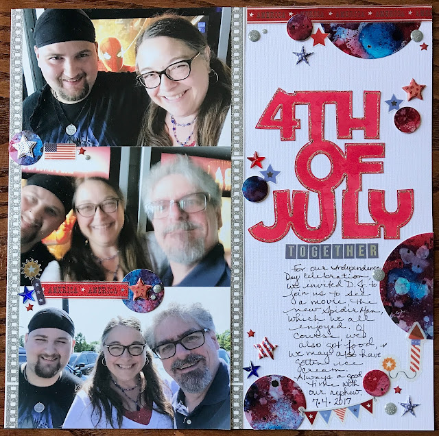
Layout Share - 4th of July

In a previous post, I shared the backgrounds I've been making with Distress spray stains, and last week, I used one of those backgrounds on a page about me, my husband, and my nephew celebrating the 4th of July back in 2017.

Here is a photo of the background I created with Distress spray stains in Festive Berries, Salty Ocean, and Black Soot.


I used my trusty circle dies to cut several different sizes of circle from the 5.25 x 4 background, using those as embellishments on my page.


For about a month, now, I've been trying to get older supplies onto my scrapbook pages, and with this layout, I was able to use some patterned paper I've had a long time, a film strip print from a Shimelle collection, which I cut into strips to border my three photos, since the story is about going to see a movie. I also used older star embellishments, including stars and enamel dots. For the title, I used a cut file from Silhouette, which I cut out on my Cameo, and some letter stickers from a Shimelle sticker pack.

As the pandemic crisis continues, I expect scrapbooking supplies to become more difficult to acquire, and I like having the ability to create embellishments from things I have on hand.

Monday, April 6, 2020

Spring Unfolding

While the global pandemic has draped a heavy pall over our everyday lives, Nature continues awakening from her winter's nap. Daniel and I have gone on a few walks in the past few days, and here are three photos of spring unfolding in our neighborhood.


Any second, those daffodil buds are going to burst forth into a yellow so brilliant, it's almost hard to look at. These are in a neighbor's yard, but I noticed we have some in our front bed, too.


This leaf caught my eye as I walked past, the way the light caught in its gossamer surface. I don't know if this is a new leaf or an old one, but whether it is forging awake or lasted through the rigors of a Michigan winter, it looked like hope to me.


My sweetheart Daniel, with trees that look bare in the background, but there are thousands of little buds on them that will soon become leaves (some maybe flowers?). I must also note that sunshine, so rare where we live, and so, so welcome.

I look forward to seeing what other delights spring has to offer in our little corner of the world.

Color Combination Play

Last week, because I was inspired by a Tim Holtz video, and to distract myself from all the bad news in the world, I started creating backgrounds with Distress spray stains and watercolor card stock. After a few, I realized that I was using the color palettes I usually go for, my favorites, so I decided to create a way to vary my color combinations.


First, I wrote the name of each of the spray stains I have on slips of paper. (There are still 22 spray colors I don't have!)


Next, I put the slips into a container, so I could draw three or four at a time to create color combinations I wouldn't normally use.

It was fun! (And don't we all need a little of that right now?)

The first combination:


Ground Espresso, Picked Raspberry, and Cracked Pistachio. I'll admit, I didn't think this combination was going to go well, even though I think each of these are great colors on their own. But...a challenge is a challenge, and there was not much point creating this little game if I wasn't going to follow through.

The first color combination result:


I used the Ground Espresso in a limited amount, and while this isn't my favorite of the backgrounds I've made, I thought it turned out pretty good.

Next, color combination number 2:


Another challenging one, Festive Berries, Salty Ocean, and Black Soot!

But look how great the result turned out:


I must admit, I was pleasantly surprised, and I've already used this background on a scrapbook page! (details in a future post).

I was starting to hit my stride, and for my third color combination, I chose four colors:


Two greens this time, Mowed Lawn and Twisted Citron, along with Squeezed Lemonade and Rusty Hinge, a little less of a challenge, but I didn't like the result as much as I did the previous one.


On another day, I played some more, though I confess I did remove Black Soot, Ground Espresso, and Hickory Smoke, simply because I find those colors a little dark for the kind of backgrounds I'm creating.

Here are the rest of my color combinations:

Four: Aged Mahongany, Shaded Lilac, and Peacock Feathers.


Admittedly, Aged Mahogany is a dark color, too, but it's oh-so-yummy, and I think the result REALLY works.


Five: Twisted Citron, Broken China, and Wild Honey, which is starting to become a favorite of mine.


The result:


If I did this combination again--and hey, why not?--I'd use the Wild Honey as more of an accent, and let the Twisted Citron and Broken China stand out more, as I love how those two colors work together.

Last, the sixth combination: Abandoned Coral, Mustard Seed, and Salty Ocean.


The result:


A definite success! I love how these colors blend together, turning coral and blue into a shade of almost purple, and turning blue and yellow into green. I can't wait to make something out of this one. It's so bright and interesting to me!

I have so enjoyed playing with these Distress sprays, challenging myself to include different colors, and seeing how they play together. Give it a try! It doesn't have to be spray stains; it could be inks, watercolors, even a box of crayons. Have fun with it!