As I wrote in my previous post, I assembled a bunch of autumn-themed supplies into a big kit to use for all the autumn-themed layouts I want to create. For my first project, I had several photos from a walk I took in my favorite local park on a lovely autumn day in 2012.
So many beautiful photos! I wanted to use as many of them as possible in one cohesive layout, and I thought I could include quite a few in a pocket page protector.
But which one?
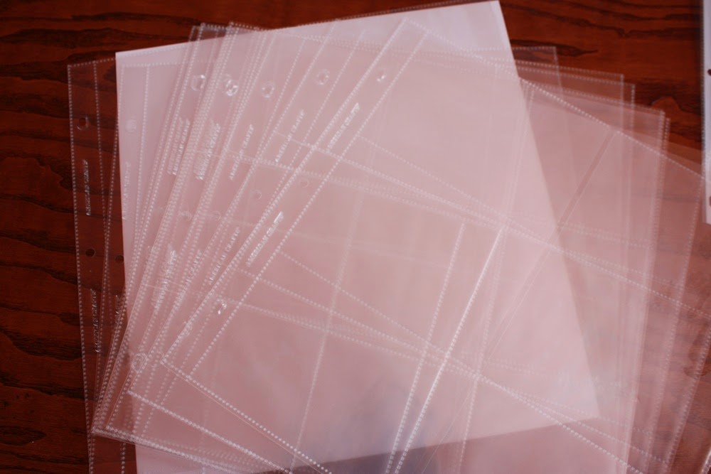
I pulled out a variety package of page protectors from American Crafts and sorted through to see which ones might work for the design I had in mind. Choices, choices...
...and I finally settled on one with 6 4x6 pockets, planning to leave one open for a card of some kind.
Next, what to do with the remaining photos? I decided to create one 12x12 page with four photos, the remaining two to be featured on two 6x6 pages in the middle.
Like this:
I rounded some of the corners on the 6x6 pages.
I stamped a border along where the three photos would go on the 12x12 page.
And I created a card for the leftover spot in the divided page protector:
Everything completed looks like this:
And here are a couple shots of how it looks in the album:
Giving a shout-out to May Flaum and Noell Hyman, who were both inspirational in my process for these pages.


No comments:
Post a Comment