

First, I wrote the name of each of the spray stains I have on slips of paper. (There are still 22 spray colors I don't have!)

Next, I put the slips into a container, so I could draw three or four at a time to create color combinations I wouldn't normally use.
It was fun! (And don't we all need a little of that right now?)
The first combination:

Ground Espresso, Picked Raspberry, and Cracked Pistachio. I'll admit, I didn't think this combination was going to go well, even though I think each of these are great colors on their own. But...a challenge is a challenge, and there was not much point creating this little game if I wasn't going to follow through.
The first color combination result:

I used the Ground Espresso in a limited amount, and while this isn't my favorite of the backgrounds I've made, I thought it turned out pretty good.
Next, color combination number 2:

Another challenging one, Festive Berries, Salty Ocean, and Black Soot!
But look how great the result turned out:

I must admit, I was pleasantly surprised, and I've already used this background on a scrapbook page! (details in a future post).
I was starting to hit my stride, and for my third color combination, I chose four colors:

Two greens this time, Mowed Lawn and Twisted Citron, along with Squeezed Lemonade and Rusty Hinge, a little less of a challenge, but I didn't like the result as much as I did the previous one.

On another day, I played some more, though I confess I did remove Black Soot, Ground Espresso, and Hickory Smoke, simply because I find those colors a little dark for the kind of backgrounds I'm creating.
Here are the rest of my color combinations:
Four: Aged Mahongany, Shaded Lilac, and Peacock Feathers.

Admittedly, Aged Mahogany is a dark color, too, but it's oh-so-yummy, and I think the result REALLY works.

Five: Twisted Citron, Broken China, and Wild Honey, which is starting to become a favorite of mine.

The result:

If I did this combination again--and hey, why not?--I'd use the Wild Honey as more of an accent, and let the Twisted Citron and Broken China stand out more, as I love how those two colors work together.
Last, the sixth combination: Abandoned Coral, Mustard Seed, and Salty Ocean.
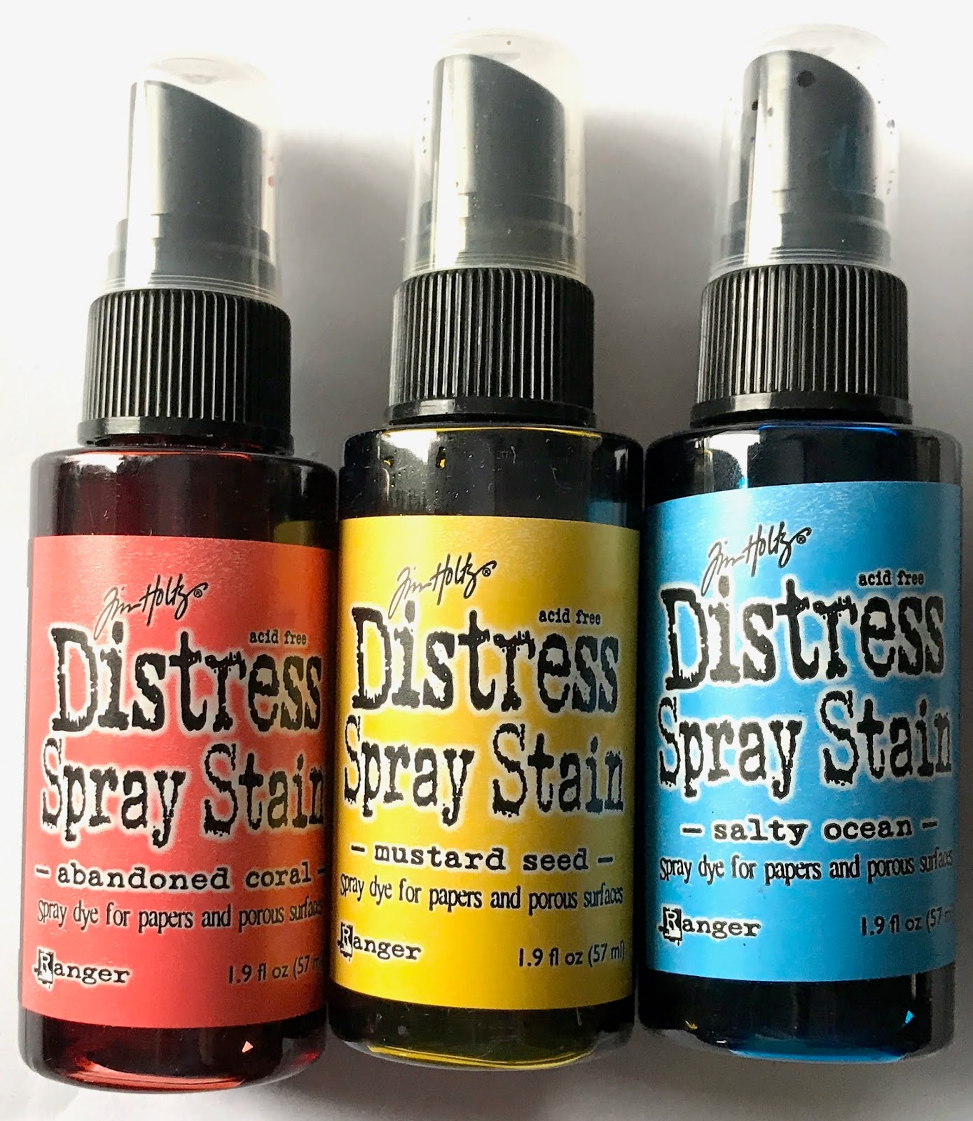
The result:

A definite success! I love how these colors blend together, turning coral and blue into a shade of almost purple, and turning blue and yellow into green. I can't wait to make something out of this one. It's so bright and interesting to me!
I have so enjoyed playing with these Distress sprays, challenging myself to include different colors, and seeing how they play together. Give it a try! It doesn't have to be spray stains; it could be inks, watercolors, even a box of crayons. Have fun with it!
No comments:
Post a Comment